Meetrics
Meetrics is a desktop application with a mobile responsive layout that helps managers, team and individuals analyze their calendars. It offers analysis pertaining to associated costs and details about the different classifications of time that occupy a person or groups business life. With Meetrics users can see how much of their day, week, month or specified date range was spent in focus time versus time allocated to meetings.
CHALLENGE
Our challenge was overcoming what initially appeared to be a simple user interface. We quickly realized at the outset, once we dove into a heuristic evaluation and user testing on the existing user interface, that our proposed adaptation of the UI would be a bigger challenge. There were an array of problem areas that our ux team needed improve.
APPROACH
Role: UX Designer
Timeline: 4 Weeks
Platform: Desktop and iOS Mobile Adaptive
Team: Claudia Zacharias, Grace Forren, Kendall Kessler
Figma
Competitive Analysis
Heuristic Evaluation
Screener Surveys
User Interviews
Affinity Mapping
Journey Map
Persona
Usability Testing 1 (UI current)
Usability Testing 2 (UI redesign)
Design System
Revised Sitemap
Spec Doc for Developers
PROCESS OVERVIEW
Managers of teams and senior leadership often feel that both their personal time and that of their teams can sometimes suffer in terms of productivity, cost and time management due to meetings.
First let’s look at a high level overview of my team’s overall process. Later in this case study we’ll take a deeper dive into specific steps and findings during the research and design phases of the UX process we employed for our client.
This project began with a brief supplied by Measurcare. Measurecare is developing a product suite for the healthcare field and the brief discussed two products, mContacts and Peer Review. In discussing our three week timeline, narrowing in on scope and discovering the primary and secondary goals the client held for our partnership we honed in on mContacts as the main deliverable. Along with the app we also built out a supporting user interface for the desktop version of mContacts to reflect the new app design solution.
HYPOTHESIS & ASSUMPTIONS
These leaders know meetings are an important part of a functional business but not all meetings are created equal. Depending on host, management and attendees meetings can range from being perceived as productive and valuable to the completely worthless… "calling a meeting just to have a meeting”.
Users want to track the financial impact that meetings take on their business
Users want to optimize time spent in required meetings while reducing the instance of unnecessary ones
Users are frustrated when meetings take up the bulk of their time at work resulting in no time to pursue personal projects or professional development activities.
PERSONA
Max works diligently to make sure she and her team are productive and valuably contribute to each other and their business objectives. She knows everyone’s time is valuable and hates getting called to meetings that are disorganized and not managed well. She wishes her colleagues would be more thoughtful and organized when asking her or her team to take time out of their own personal work or professional development to meet
As our understanding deepened we set out to determine the following for “Max”:
How might we provide Max digital tools to team leaders and senior leadership that help them manage, track and analyze the success of their internal and external meeting trends.
THE RESEARCH
Research should always inform and shape all aspects of the user experience design process. Our initial approach, in this case, was to start with a competitive analysis and a deep dive heuristic evaluation of the current user interface on the Meetrics site. Our competitive matrix and feature analysis helped inform our design but the key to our process was the major problem areas in the heuristic evaluation.
Our heuristic evaluation went a long way in helping our team determine the critical problem areas and, conversely, the areas where the site fared well which we carried over into the revised user interface and design system.
Heuristic Evaluation for Existing Meetrics Desktop User Interffac
USER INTERVIEWS
For the right demographic user set for interviews our team sourced ideal users from a screener survey. We followed up with interview for individuals who have or recently have managed a team of five or more individuals for both startups and established corporations.
DATA SYNTHESIS
To establish patterns and themes from our interviews we created and affinity map and discovered major themes around the following areas:
Success factors, methods and indicators
Motivations driving meeting tracking and management
Management Tools: software, home-grown, documentation and other tracking methods
Types of meetings
Time spent in meetings vs personal productive time.
JOURNEY MAP
The goal of the journey map was to use the qualitative data from our interviews to accurately narrate the potential customer’s experience from start to finish. We also looked to discover what features might be needed/missing and what works well to better understand what we should take into account as we ideate. Once we did that it was easy to see opportunities in the customer experience. Our journey map illuminated the following opportunities:
Offer alerts for available focus time blocks in their calendar, either weekly or daily, by preference.
Prompt notifications: "Do you want to schedule any focus time this week/today?”
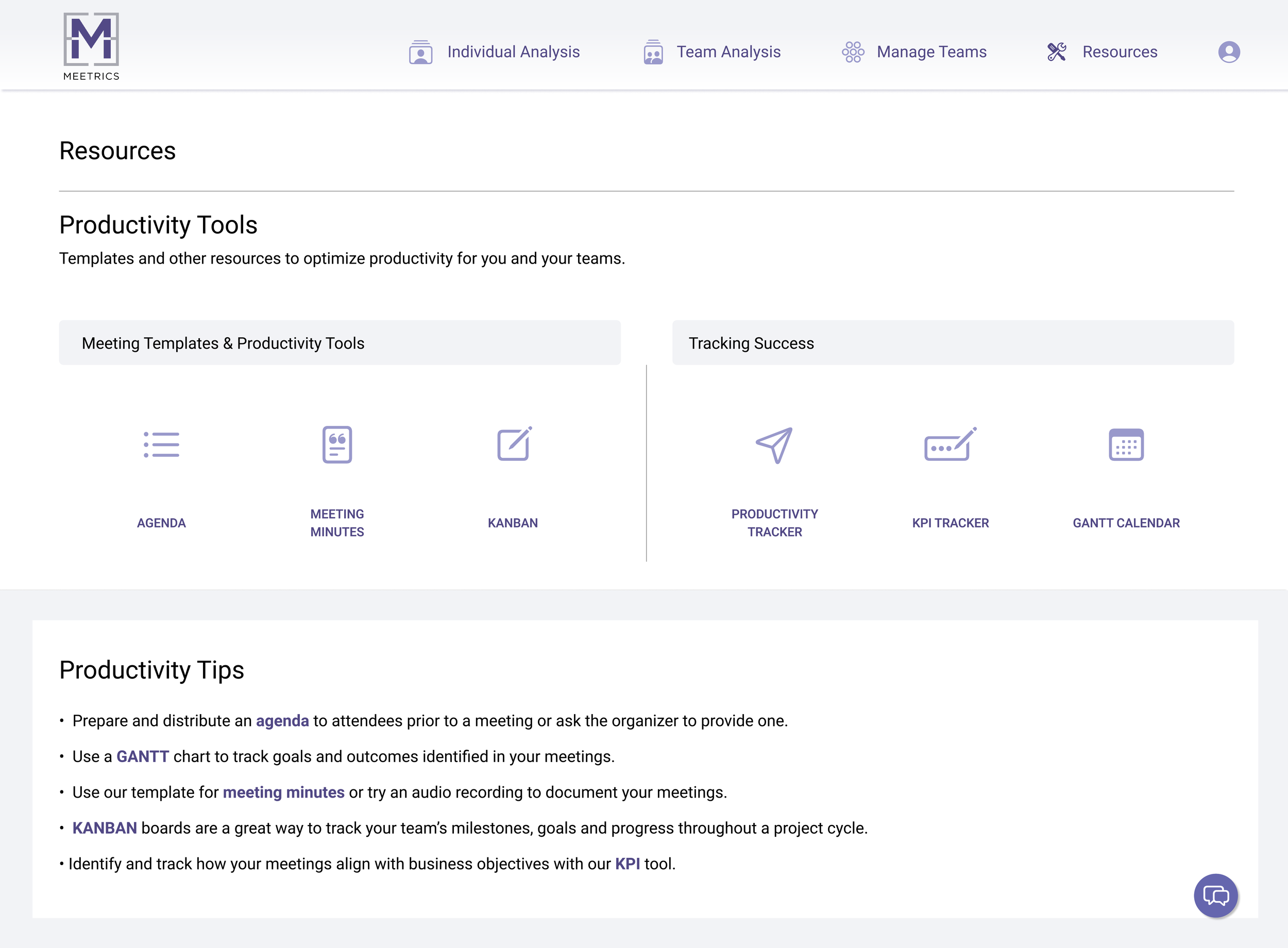
Templates: Offer templates for agendas, meeting minutes, outline takeaways of what needs to be completed post meeting and other items supporting meeting organization tools and documentation
Project milestone markers to keep track of the different phases or stages of more complex projects.
A proper meeting with an agenda and next steps is more productive than an impromptu drive by.
Time/project stage tracker to break down a project in pieces before completely due.
From these insights we developed our persona, “Max” who captures the characteristics that represent the most common traits, goals, needs and frustrations discovered in our user interviews and through affinity mapping.
THE DESIGN
FEATURE PRIORITIZATION
PRIMARY FEATURES
Call out for standing meetings to help differentiate from those that may not be as productive
Resources tab with templates, meeting minutes tools, Kanban boards, and other resources
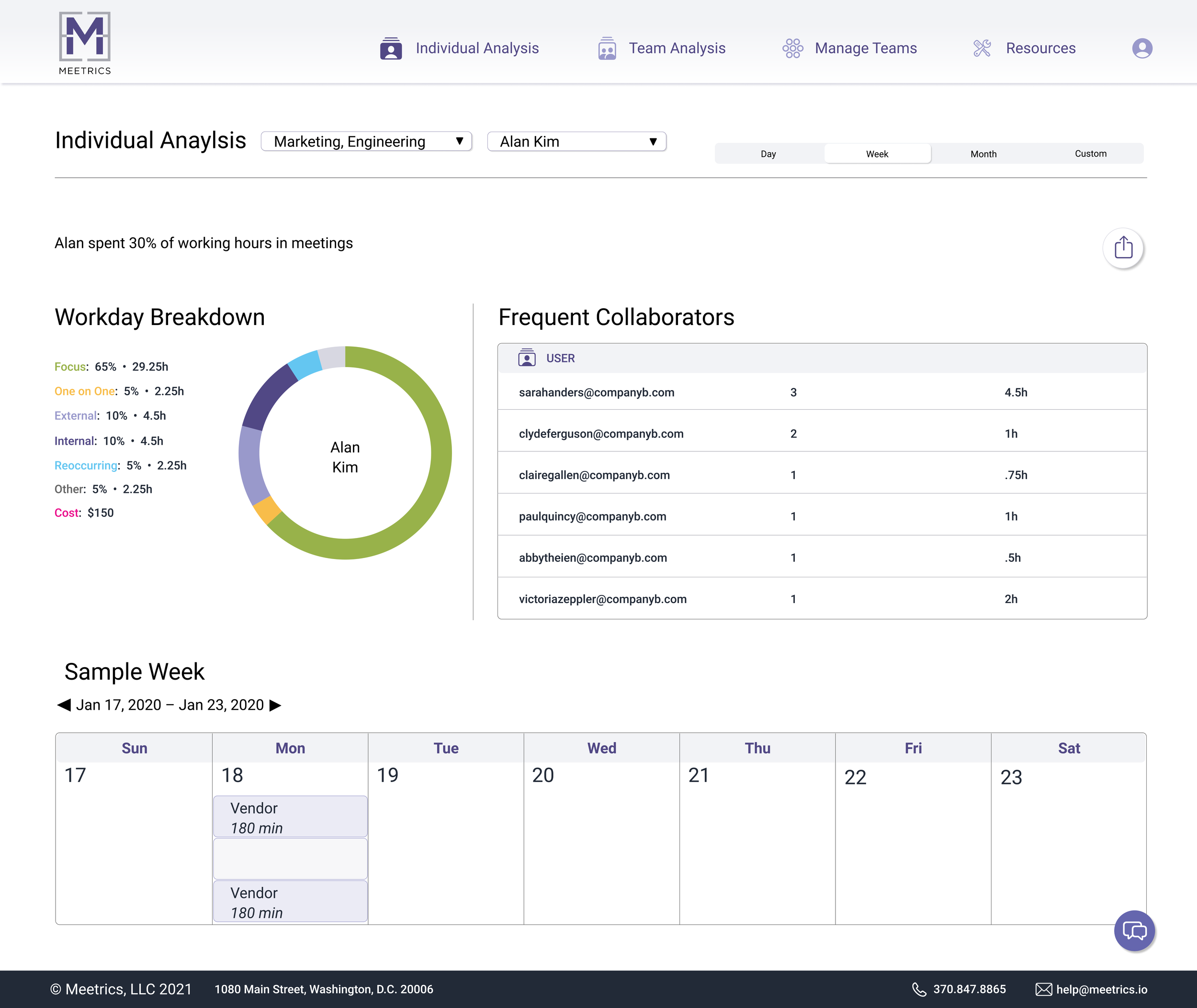
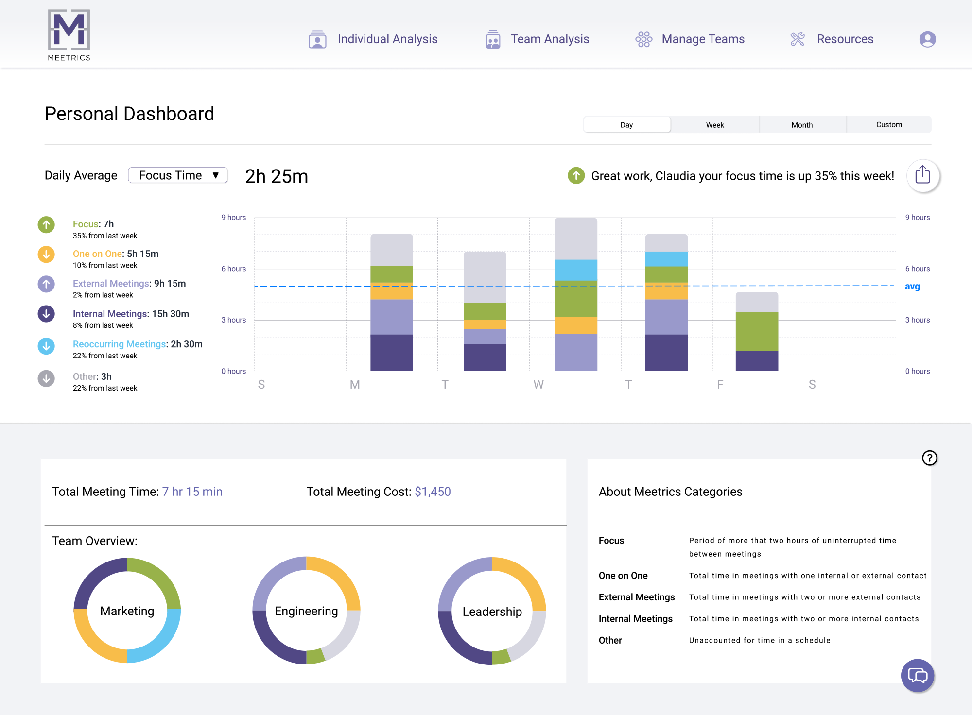
Graphs and charts that are easy to read to identify how users spend their time
Profile page and Add user(s) + create team
SECONDARY FEATURES
Team, personal, and individual analysis pages (based on round one of user testing)
Export button for data and graphs
About category(ies) descriptor
USER TESTING ROUND 1 - Existing Desktop UI
We tested 3 scenarios inspired by our persona with a total of eight tasks using the existing Meetrics site. We tested five users over video call and participants narrated their actions while take control of our mouse to explore the Meetrics site after we logged in to capture positive or negative feedback and general impressions as they interact with the product. We documented participant time on tasks and participants score the prototype from 1-5, (1 very easy - 5 very difficult). We then record these results on a scored card to view the data visually.
From these user tests we were able to see some real pain point that we needed to address in our iteration of the new user interface, layout and flows. Five out of eight tasks had a success rate of 50% and lower.
Here are some insights derived from round one user testing that helped us move informed our choices as we moved into the design phase.
Clear indicators so users know when they are on a certain page
Top navigation for a cleaner look
Fewer scrolling options and clear UI to show different data points/sections through visuals as well as secondary and tertiary navigation
Clear differentiation between individual and personal dashboards/analyses and team analysis
Ability to add user directly from a pre-created tag/group and not just through the "All Tags" option
Change language for "Tag" to group or team
Position UI buttons in top right and bottom right to align with natural eye progression through screen
Use donut graphs or bar charts instead of current data visual on "Team Analysis" page
Add Resources tab to primary navigation (based on user research findings)
See usability testing notes for more detailed data
DESIGN STUDIO
We followed feature prioritization with a design studio. Design studio is a tool we use to quickly ideate the main screens of the product interface. We focus on features and placement and taking the best ideas from each sketch round, stealing from each other and scrapping what doesn’t work. This helped us move forward with a clear cohesive vision and a unified consensus on how to start our design process with mid fidelity screens in Figma.
NEW DESIGN SYSTEM, USER INTERFACE
I lead our team in establishing a cleaner design system to address the overwhelming color palette on the existing site (primary red, green, yellow etc.)
An elegant design system with a more cohesive and robust color palette, fresh iconography, redesigned logo and a consistent hierarchy for display versus body text and call outs.


USER TESTING ROUND 2 – Redesign Desktop UI
For round two testing we used the same scenarios and tasks from round one in order to maintain a directly comparative test environment. We saw some major improvement but also some areas that needed further attention. In the second round of testing we only had two tasks that were a success rate of 50% or less. Additionally the final two tasks were all completed with 100% direct success.
However tasks around finding information on meetings with external individuals and accessing one’s personal schedule both performed badly.
Major takeaways from round two testing were the following:
Pain points were most commonly found with users not understanding verbiage on the existing and redesigned site (which used the same language as the existing site). Because of this, we recommended doing an open and closed card sort to find how people label and group information found on the site to better the user's experience with Meetrics.
User research revealed users need resources to have more productive. Testing of the resources tab in the redesigned site found that additional testing and card sorting were essential in order to make this a more intuitive feature for Meetrics users.
The heuristic evaluation revealed issues with security, controllability, clarity that need to be addressed by the engineering and development teams.
UI graphs and charts on the redesigned site were received better than the graphs and charts on the existing site. We recommended incorporating these in a third round of testing before adopting them into the Meetrics platform.
ADAPTIVE iOS MOBILE UI
Below are some sample screens representing the adaptive iOS mobile version of Meetrics site. The aesthetic is base on the new Meetrics design system while supporting the narrower scrolling functionality experienced in a mobile view. Tap behaviors and visual specifications for both desktop and mobile layout were detailed in our Spec Document.
CONCLUSION
Through user research and usability testing on the existing site (as well as the high fidelity prototype), we concluded that users found the site provided good data but identified areas where improvements could be made.
We found that users wanted more than just data out of the site/app; they wanted solutions and resources to help them run more productive and efficient meetings. With this in mind, and after usability testing the existing site, we addressed pain points identified through research and found in round one of testing in our redesign.
Round two of usability testing revealed issue areas in the redesign (see pages 82-98 for recommendations on how to address these) and confirmed the need for another round of prototype design/improvement as well as testing.
Final client deliverables included:
Comprehensive project report with deep-dive information regarding all aspects of the process, from research to design
Spec document to guide Meetrics developers in implementation of the new design system
Recommendations for next steps in the iterative process
Final Figma and Zeplin files


