Ford Motor Company
Working at an agency, with Ford as my client, means limitations on what I can share related to work in progress. However, the following case study will review the evolution of the online update process for Ford’s SYNC (in-vehicle) operating software and Maps navigation software. This study will review the prior live state of the European and North American experiences and my human centered design approach to bridge the two disparate experiences into one cohesive, global experience. The retired experiences were public facing, as are the newly designed and launched experience pages live on Ford.com today.
CHALLENGE
There were a few key challenges that had to be considered in my efforts to optimize the SYNC software update process for users in the EU and North America. From unifying two very disparate experiences to navigating complex engineering issues related to release versions here are some of the primary challenges I was facing:
Role: Senior Experience Designer, UX
Timeline: Q4 2021
Platform: Desktop and iOS Mobile Adaptive
Team: Claudia Zacharias, Rashaud Brooks, Kelly Langton
Sketch + InVision > Later Conversion into Figma
Combining two disparate market experiences under one global design system
Understanding the various generations and versions of software updates and how those affected the customer journey
Partnering with subject matter experts to identify all outcomes a user could encounter while understanding the limitations of dated software and dated update delivery parameters
Truly prioritizing the customer journey in a process that, in practice, is confusing, redundant and frustrating for users
APPROACH
Current state user flow analysis by market
Research synthesis of Ford.com user feedback
MoSCoW mapping and feature prioritization matrix
Wireframe design
Weekly stakeholder reviews
Usability testing (wireframes and high fidelity)
Managing handoff to CRUX partner to apply global brand system to wireframes
Embedded UX team reviews within development sprints and planning
Miro workspace detailing the North America and EU live web experiences before research and iterations.
PROCESS OVERVIEW
This UX project was initiated by Ford leadership. The business objective was to create a new experience that could fold in the disparate experiences between Europe and North America to bring them both under the Ford Global Own design system.
To our benefit Ford had prioritized, through the support of VMLY&R, creating a comprehensive design system across their various digital properties. In so doing some areas of consideration, such as accessibility and standardization of visual assets and components, was managed through the design team in charge of the system and a team of accessibility compliance experts.
Our goal was to not only unify the two experiences visually but to improve upon the clarity, simplicity, and process of accessing updates across all generations of SYNC software packages. The challenge in this area was that delivery of updates could come in any configuration of updating at a dealership or via USB, WiFi or Ford Power-Up Over the Air Updates depending upon SYNC generation.
SYNC currently has four live generations of software (along with multiple subsequent updates released within each generation) spanning a decade of vehicles and models. This clarity and learnability considerations, related to a heuristic value approach, made dealing with this issue a critical point to focus our design with an empathetic approach.
HYPOTHESIS & ASSUMPTIONS
Our hypothesis centered around how might we enable seamless updates across all generations of SYNC users. With that in mind we were working with the following assumptions.
Users find the update process confusing
Users want a simple and straightforward process for updating their SYNC and Maps
Users don’t always know which version their vehicle is operating (affecting their ability to download the correct software package)
Users don’t understand that SYNC and Maps require different steps to download and update
THE RESEARCH
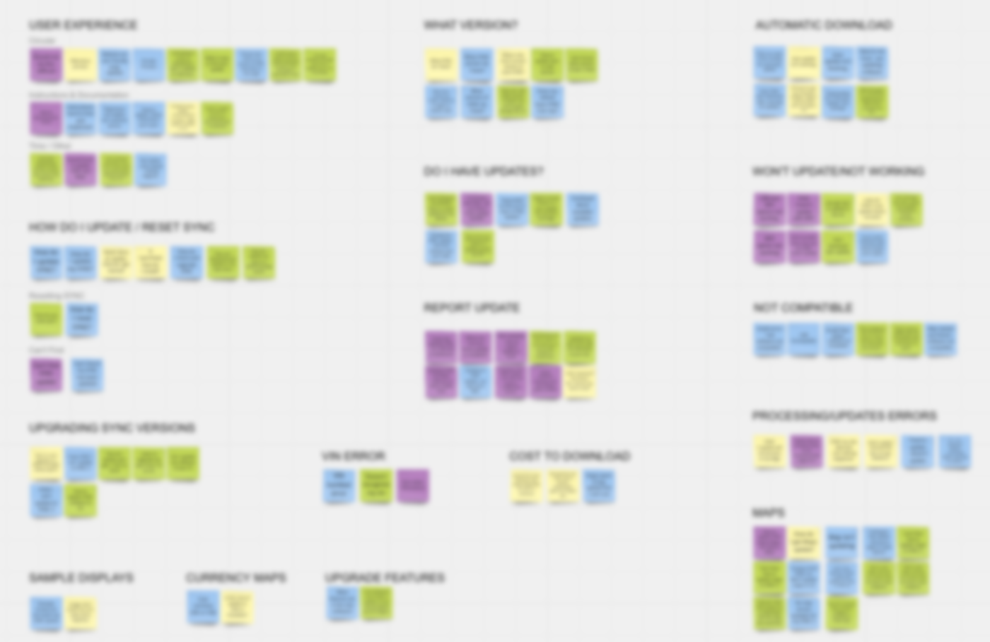
Research was at the forefront of this process. Unlike traditional methodology of interviews or surveys I leveraged existing data collected on Ford.com customer feedback. To do this, and create a large enough sample size, I collected 5 weeks work of collected data. The data was sorted in expansive spreadsheets. To collect the right data I had to manually search in Excel to find all instances of key words related to the SYNC experience and capture the user feedback related to those terms.
Luckily, there were plenty of customer inputs clearly stating problems, frustrations and a few successes users encountered in their efforts to update through Ford.com.
Additional research included studying the two current state flows for North America and the EU as well as generating a list of key insights derived from through research synthesis.
Research Synthesis from Ford.com User Feedback
Proprietary Content Blurred
THE DESIGN
FEATURE PRIORITIZATION
Although a Ford directive for UX was to always design mobile first that wasn’t optimal for this experience. The reason for that was that upwards of 80% of users would have to download the updates to a USB device to then load into their vehicle. Mobile users, as a result, had to be redirected to visit the site via desktop or laptop to complete the process.
There were a few key elements intended to create an easier experience for users, including:
PRIMARY FEATURES
A vehicle “Card” set apart from the process flow to give current state awareness to customers. Information in this card included the users’ VIN, current SYNC generation, SYNC update version (if applicable), current Maps generations, Maps update version (if available) and update release notes.
VIN entry or Login to pull back-end data to inform future steps available to the user based on installed SYNC/Maps generations and available updates.
A cascading, numbered series of steps, instructions and content based on what software update delivery methods were available to their SYNC generations (could be any combination of WiFi, USB, Over the Air or Dealership pulled from API call)
A quick links column under the vehicle card to direct users to frequently accessed articles and resources related to SYNC and Maps
A FAQ section relaying answers to the most common questions identified in research synthesis
USER TESTING
Using UserZoom.com I set up two rounds of tests. First, we looked at the wireframes performance which across the board was relatively successful in terms of scenario and task completion. There were a few areas of improvement, for example users had difficulty activating the link on the new version update language in the card to access release notes for that version. I made a few design tweaks and added some contextual language which improved the success rate when we launched the high fidelity tests.
After a few tweaks to the wireframes I handed off the files to my CRUX partner to apply the Ford identity and other high fidelity visual elements. We then tested again to document success and improvements.
High Fidelity Design
To see the live experience please visit
www.ford.com/support/sync-maps-updates/
DESIGNING WITH DEVELOPERS AND SUBJECT MATTER EXPERTS
During this project I was embedded with the business line in charge of the SYNC customer facing product within the Self Help team. As such I participated in all daily standups, retros, refinement, design reviews and other activities that happened throughout the developer sprints.
I also had regular touch base meetings with engineers and other back-end SYNC and Maps experts to understand the very nuanced details and limitations I needed to consider throughout the process.
In the end handoff from high fidelity to the development team was successful as partnering with them very early on meant the whole team was on the same page and working towards the same goal.
CONCLUSION
The SYNC and Maps update experience was rewarding and, I hope, continues to serve the Ford owner community in an optimal way. I was transferred to another team shortly after the SYNC experience went live, but from speaking with the Product Owner at Ford, it has really improved customer feedback. It would have been nice to stay on the team to continue to gather insights and progressively iterate the design, but agency life means adaptability and being ready to enter new and different work streams with short notice.


